Thursday 2 July 2015

Artificial Beauty: A Modernist Series


“Artificial Beauty” is composed of eight black and white photographs. These images represent the abundance of makeup products I noticed when coming to Stirling in comparison to where I am from.    

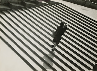
My work is influenced by Alexander Rodchenko (1891-1956), particularly his photograph The Staircase, which features intense diagonals and cropping that is unusual compared to what I’ve learned in traditional photography classes. I was also inspired by Alma Lavenson (1897-1989), who shot ambiguous photos of herself, showing an unclear perception of who she really was. This is why I chose to show hands holding lipstick and part of a face cropped and reflected into a mirror in my images, because these body parts didn’t portray the identity of a specific person. I chose the topic of makeup specifically because I feel as though it is heavily emphasized in the UK. The malls where I’m from and where I go to university in America both don’t have any makeup stores, yet Stirling’s, which is a smaller town, has at least two. A large portion of the University of Stirling’s pharmacy is dedicated to makeup, the mouse pads in the 24/7 lab feature a brand of concealer, and in the bigger cities, huge displays of models are featured in many shop windows. Early modernist photographers used social issues as subject matter, and I feel that my using the excessive abundance of makeup as a topic shines a light on consumerism, and a desire to purchase products completely unnecessary for human survival or improving the quality of life.

"Artifical Beauty” tells a story of a girl going to the store, becoming overwhelmed by the selection of makeup, finally picking some out and buying it, putting it on, and then what little remains of it at the end of the day. The use of intense angles in the first half of the series symbolizes the chaos of being faced with so many choices. The alternation of the direction of the angles from one image to another creates successful flow. By using mirrors and windows for the last portion of my series, I managed to capture tools for the application and removal of makeup in completely natural lighting. I chose to use a black and white colour scheme for the series not only to pay homage to original modernist photography, but also to show that although in real life the multitude of colours that makeup is available in are visually appealing, the display and concept becomes significantly less exciting when that element is removed.  

Although the concept of makeup is trivial in comparison, I was inspired by El Lissitzky’s (1890-1941) ability to use photography to promote soviet patriotism in a positive light and convey equality among men and women. Some viewers may not understand my series, but I hope that the lengths that some women go through in order to feel confident, or even acceptable, are portrayed and that society’s misconceptions about beauty are thought about critically by viewers.

Inspired by the bold statements modernist photographers could convey with simple images, I have attempted to present a strong message to my viewers. Society should be ashamed for tricking girls into thinking they aren’t pretty enough for monetary gain, and consumers should also be upset for buying into it for so long. I would like to inspire people to reconsider spending money on huge quantities of designer makeup because at the end of the day, all you are left with are a few smudges on a cotton pad headed for the trash.


Tuesday 30 June 2015

Preliminary Notes on Modernsim


http://time.com/104072/paul-strand-retrospective/

-Paul Strand (1890-1976) was a pictorialist until visiting a gallery owned by Alfred Stieglitz. Stieglitz criticized the graphic softness of his work which inspired Strand to completely change his style and direction. “straight up” documentary style, believing that the use of technology, especially the camera, could improve humankind.

- Blind is a blind lady in NYC. Strand would put a fake lens on his camera and really photograph the subject with a lens hidden under his arm. Documented photography but kept the clean aesthetics of modernism.

-Wall Street has no focal point and seems abstract, ugly at the time. Straight shot of workers going about their day. Overall he wanted to use modern art to show the humanity seen in western artistic traditions.


1916, 1915


-Strand visited New Mexico 1930-1932, made portraits of artistic friends & acquaintances. Returned in 1934 to photograph art, architecture, and landscape of the area.


Near Saltillo, 1933
Rebecca (1932)


-Lissitzky’s work spoke for the prevailing political discourse of his native Russia, and Soviet Union.

-Used color and basic shapes to make strong political statements.

-USSR Russische Ausstellung (1929). To show the equality of men and women.

-The Runner (1930) Split into vertical sections to symbolize movement. Visual fragmentation when one looks at the parts rather than the whole. 

-The Staircase (1930) Alexander Rodchenko- used unusual angles and perspective. Woman with a child placed among the manmade enviromnet. Off kilter angle of the stairs and her shadow is cropped partway out of the photo. Random dark portions of the environment in 3 out of 4 of the corners.  


-Compositions such as this were an important influence on New Vision, the modernist photography movement that gripped Europe in the 1920s and '30s.

Ships in the Lock (1933) Rodchenko


-Lavenson was another pictorialist turned modernist, due to critiques from Edward Weston. She emphasized formal qualities of architecture, machinery, and still lifes.

-inspired by the idea of light on metal and the way it would gleam in the sunshine.

-Joined f/64 photo club in 1932, produced stark depictions of nature in the American west. The group was about conformity and presented a unified way about what the new modernist approach for art should be.
Composition in Glass (1931) Alma Lavenson
 
Self Portrait (1932)

Monday 29 June 2015

Pictorialism Essay


Photography as a Form of Art

Pictorialism emerged as a style of photography in the 1910s and was considered the first photographic movement. Artists were trying to prove that photography could be an art form and not just used for documenting portraits, families, or scientific concepts as it had mainly done in the past. The pictorialism movement was building off of the impressionist painting movement of the 1860s-1880s and it displayed that the fog, low light situations, mist, and strong contrast between lights and darks of impressionism could be accomplished through photography as well (Borda).

            Before pictorialism, photography was seen as pristine and crisp, generally done in studios or with snapshot cameras. Pictorialist artists such as Doris Ulmann (1882-1934) brought photography into the real world by using rural people in their homes as subjects.  Nature was also commonly photographed by artists such as John G. Bullock (1871-1933), who especially liked to capture reflections in water and tree limbs and shadows. The emphasis in pictorialist images wasn’t the subject though, but rather the mood or emotional impact shown by the photographs. (Borda).

            My pictorialist images were taken around the Stirling area with a digital pocket camera and handmade filters. Images 6-8 in my series remind me of Bullock’s work because they are of trees, bridges, and the reflections they make in the water. Bullock’s Beech Trees near Pebble Beach (fig. 1) reminds me of my image #7 because trees, water, and hills in the background are the subject matter in both. In both, the image reflected into the water is blurrier than what is seen on land. Although the placement of the trees is very different in the two photographs, I think the overall message is the same. Both images convey tranquillity and a feeling of being comforted by nature’s surroundings.

            Image #9 in my series was shot on the Stirling Bridge and the detail in the bricks and how they fade as the eye travels further back into the photograph reminds me of authentic pictorialist images from that were using a shallow depth of field to mimic the way lines blurred together toward the back of some impressionist paintings. Joseph Kiely’s A Garden of Dreams (fig. 2) is similar to my #9 because both have water on the left side and a winding overpass on the right side of the frame. They both feature a blobby, faded look on the trees, yet sharper detail on the paths. Both photographs also show subtle differences in the colours of the sky but a strong contrast between the darkest and lightest tones of the images overall.

            Artie Van Blarcum’s Train Station (fig. 3) and my image #2, shot at Mar’s Wark Ruins, share many similarities. Both images show brick arches and detailing in the surrounding iron gates and barriers. There is a strong contrast between the light reflecting off of the higher up bricks and an ominous darkness happening in the bottom of the frame in both photos as well. Although my picture uses sunlight and Van Blarcum’s uses artificial lighting, the fact that the light is coming from the top in both gives the feeling of being in a confined space and having to look up and rely on the lighting to find a way around. Compositionally, another similarity is that the highest part of the top arch barely fits within the top of the frame in both images. Both were shot with portrait style orientation as well.

            One of my favourite images from this group is my image #3, which was shot at Old Town Cemetery in Stirling at about 6pm. I shot this image from the top of a hill overlooking the cemetery and placed the grass and lower parts of the cemetery in the bottom third, the buildings, trees, and majority of the cemetery in the middle third, and the sky in the top third of the image. The buildings in the background are relatively in focus in comparison to the graves in the centre of the photo. The graves look like they are very much alive and moving and remind me of a city scene of people that would be moving about, captured with a slower shutter speed to make them blur. Marsh (fig. 4) by Imogen Cunningham (1883-1976) has a similar aesthetic because the tree branches in the top of the frame are in focus but the branches and grass in the bottom third aren’t, and look like they could be blowing in the wind.

            Before this assignment, I never knew what pictorialism was and now that I have practiced on a digital camera, I think it would be interesting to try and recreate these effects with a film camera and some adjustments of filters in the darkroom. It was a beautiful time for photography and unfortunately with the smartphone and digital camera craze of today, images like these are rare to come by in modern times.
Figure 1
 
Figure 2
 
Figure 3
 
Figure 4
 

REFRENCES

Borda, Sylvia. "Pictorialist Photography ." Urban Image Fotography. University of Stirling , n.d. Web. 24 June 2015. <http://urbanimagefotography.blogspot.co.uk/p/pictorialist-    photography-overview.html>.

Borda, Sylvia G. "Session 2: Pictorialism." University of Stirling. Stirling. 22 June 2015.   Lecture.
 

Wednesday 24 June 2015

Pictorialism

Camera used- Sanyo pocket digital camera 12.1 megapixels


Clear filters: 1. Bottom of plastic cup (top left), 2. shampoo in plastic (top right), 3. lined side of cup (bottom left), 4. chapstick and eyeshadow powder in plastic (bottom right).

Colour filters: 5. Purple plastic (top left), 6. crumpled red tulle (top right), 7. green tulle (bottom left), 8. yellow plastic and light blue tulle (bottom right).

1. Tolbooth Clocktower, Stirling
Filter #7

2. Mar's Wark Ruins, Stirling
Filters #3, #8 

3. Old Town Cemetery, Stirling
Filter #2

4. Old Town, Stirling
Filter #6

5. Old Town Cemetery, Stirling
Filter #2

6. Stirling Bridge, Stirling
Filter #7

 7. Stirling Bridge, Stirling
Filter #4 and breathing on camera lens for fogging effect

8. Stirling Bridge, Stirling
Filter #8

9. Stirling Bridge, Stirling
Filter #5 

Tuesday 23 June 2015

Camera Obscura Essay


Camera Obscura: The History and The Process

By Katie Prigge

 Camera obscuras have existed since ancient times, using a pinhole in a dark room and the filtering in of light to trace images, but it wasn’t until the 16th century that a telescopic lens was incorporated into the medium (Greenspun). By the 17th century, camera obscuras had gained popularity and were used for both scientific and artistic purposes. An example of a scientific use of the camera obscura was Johannes Kepler (1571-1630), who used the camera obscura to view the sun and sunspots since these were damaging to stare at directly (Borda). Camera obscuras were used to accurately map out city scenes, yet also to make images that portrayed cities as appealing and encouraged people to live there. As an art purpose, camera obscuras were used to create portraits.

            The famous portrait titled Girl with a Pearl Earring by Johannes Verneer (1632-1675) was created with a camera obscura (Borda).  It is for this reason that the close up features of the girl’s face are soft and blurred whereas the creases in her fabric are more in focus. The camera obscura was unable to simultaneously focus on every layer of depth of the subject that Verneer was painting. Other characteristics of paintings done by artists using a camera obscura include oddly large or small hands, the edges of buildings shrink towards a vanishing point, or a ring of yellow light in the middle of the image. In landscape scenes, people were often added in later, since in real life they were moving too fast for the camera obscura to capture (Borda). Because of this they were often too large, as seen in Canaletto’s (1697-1768) Venice: the Grand Canal with S. Maria della Salute towards the Riva degli Schiavoni, where the people are equally as tall as the boats they are on.

            My original camera obscura had many problems, the most obvious being that the box was too big for my digital camera. When my digital camera was sitting in the box and took a picture it was only tall enough to capture the bottom half. Another problem was that the images in general were very faint. I fixed these problems by making an entirely new camera obscura, wrapping the outside of the box with tape multiple times to make it more light tight, and putting a piece of cardboard in the back with a hole cut out that was the size of my lens so that less light could come in from the back. The third problem was that the screen wasn’t tight enough. I fixed this in my new camera obscura by pulling on all sides of the bag before I taped it down.

Even with these adjustments, there were still some problems that were unavoidable. All of my images were most focused in the middle and gradually fanned out to be less focused. This was because the camera obscura lens was located right in the middle of the frame and wasn’t large enough to encompass the entire image with the same accuracy. Another problem was that my screen would get slightly crumpled as I moved the inner camera obscura box in and out of focus.

The aesthetics my images resemble that of Canaletto’s city scene paintings. He liked to include people and the bustling streets in his paintings because this would make a city look thriving and inviting. My second image includes a large group of people toward the bottom of the frame and my third image features a few people and cars closer up. My sixth image has the entirety of the Church of Wellington shown in the centre of the photo, which reminds me of Canaletto’s placement of the arch in View of the Arch of Constantine with the Colosseum.

 REFERENCES

 Borda, Sylvia G. "Module Excursion." University of Glasgow. Glasgow. 19 June 2015.  Lecture.

Borda, Sylvia G. "Session 1: Camera Obscura." University of Stirling. Stirling. 15 June 2015. Lecture.

Greenspun, Philip. "Learn about Photography." History of Photography Timeline. N.p., June         1999. Web. 23 June 2015. <http://photo.net/learn/history/timeline>. 

Saturday 20 June 2015

Camera Obscura Assignment: by Katie Prigge

 
Back view of camera obscura

Camera obscura inner box screen

Front lens of camera obscura
 
1. University of Glasgow, Glasgow
 
 
2. University of Glasgow, Glasgow

3. University of Glasgow, Glasgow

4. University of Glasgow, Glasgow
N.B. Halo effect due to lack of light tightness in Camera Obscura and digital camera focusing on the centre, exactly where the lens is placed.

5. University of Glasgow, Glasgow

 6. Church of Wellington, Glasgow
N.B. Screen slipping out of place at the corners due to repeated use of the Camera Obscura, causes distortion.
 
7. University of Glasgow, Glasgow

8. Lion and Unicorn Staircase at Memorial Chapel, University of Glasgow, Glasgow